Funnel charts can be used in sales representations which can be used to show the sales in each stages and the potential revenue. It gives a unique representation to the business data that you are trying to show. The data can be arranged in descending (or ascending) order for clear representations using funnel chart. An ideal funnel chart begins from a 100% and then shows the stages in which fallouts happen until the last stage is reached. Funnel charts along with the research data about the items are lost during the process can be very much helpful in identifying the major bottlenecks of a process. This post is about creating funnel charts in Word, Excel and PowerPoint 2016.
First lets see how we can represent in Excel 2016.
How to create a Funnel Chart in Excel 2016
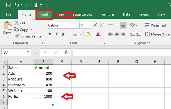
- Select the data which you want to represent in chart form.
- Click on Insert tab at the top.
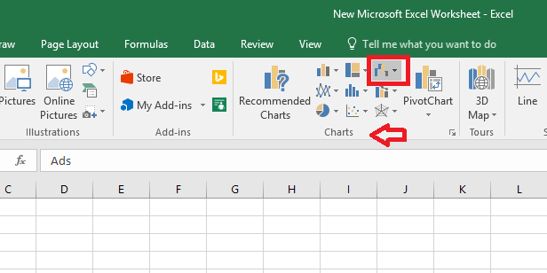
- Click Insert Waterfall or Stock chart. This can be seen under charts in the top row where a few illustrations of various chart representations are given.
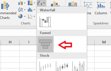
- In the menu that opens, click Funnel.
- You can click on the brush icon next to the chart to customize your chart.
- Under Style, various representations are given. And under Color, many color schemes too. Choose the ones you like and create your own designs.
- Now, if you want to add a new value to the chart, type the value in cells.
- Select the chart by clicking on it.
- Click Design.
- Choose Select Data.
- Now select the cell in which you’ve entered the new values.
- Press OK and the new values will get added in the graph.
How to create a Funnel Chart in PowerPoint 2016
- Click Insert.
- Click on Charts.
- Choose Funnel from the list of options. Click OK button.
- A template funnel chart appears along with an Excel sheet. Customize the chart the way you want it by making edits in the Excel sheet. The changes will be reflected in the PowerPoint chart representation.
- Here also you can change the color and representation by clicking on the brush icon near the chart.
How to create a Funnel Chart in Word 2016
To insert in Word 2016 follow the same steps as in PowerPoint. That being:
- Click Insert and select Charts.
- Choose Funnel.
- A Funnel chart appears along with an Excel sheet data. Make the necessary edits in the Excel sheet. The chart changes accordingly.
The best analysis can be performed if we have the data represented in forms that can be easily understood. And funnel chart is a unique representation that can be used in many cases where other type of diagrams don’t fit in. Hope it helps!


